
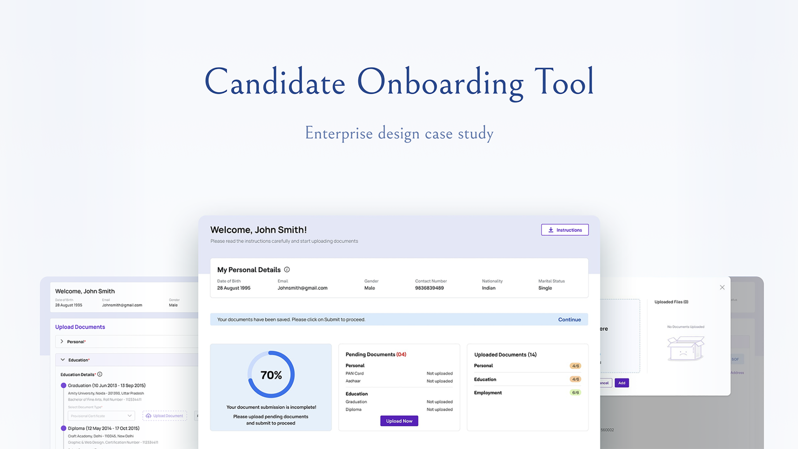
This candidate onboarding portal was used for candidates to upload background verification documents as part of the company’s onboarding protocol. However, users found the portal confusing and faced difficulties in uploading the right documents.
The company is an IT consulting MNC with over 100,000 employees in more than a hundred countries. The portal was an internal tool, owned and operated by the HR department, which made HR my client on this project. Its users were new joiners from all over the world, and the portal had around 1,000 unique visits per week.
I wasn’t the only designer on this project. I was part of a large team of designers, and my focus was user research, strategy and ideation. The final UI design was done by another designer on the team.
Disclaimer: Some names, logos and data have been changed or hidden to protect confidential information.
Process
01
DISCOVER& DEFINE
User interviews
02
IDEATE
User journeyUser flowWireframes
03
DESIGN
UI design
Discover & Define
User interviews


The users were new joiners based across the globe, so cultural differences shaped both the interview script and the questions I asked. I had to keep in mind how people from different cultures interact with UIs, for example whether they read right to left or left to right. Some feedback can also get lost in translation, so I repeated each user’s point back to them to confirm I had understood it correctly.
Scheduling the interviews was a challenge in itself. Even though the users had only recently joined, they were busy with other onboarding tasks, so I had to plan carefully to be available whenever they were, sometimes in a completely different time zone.
Objectives
- Understand the workflow and context in relation to the task of uploading documents on the portal.
- Identify user pain points and opportunities.
Key pain points

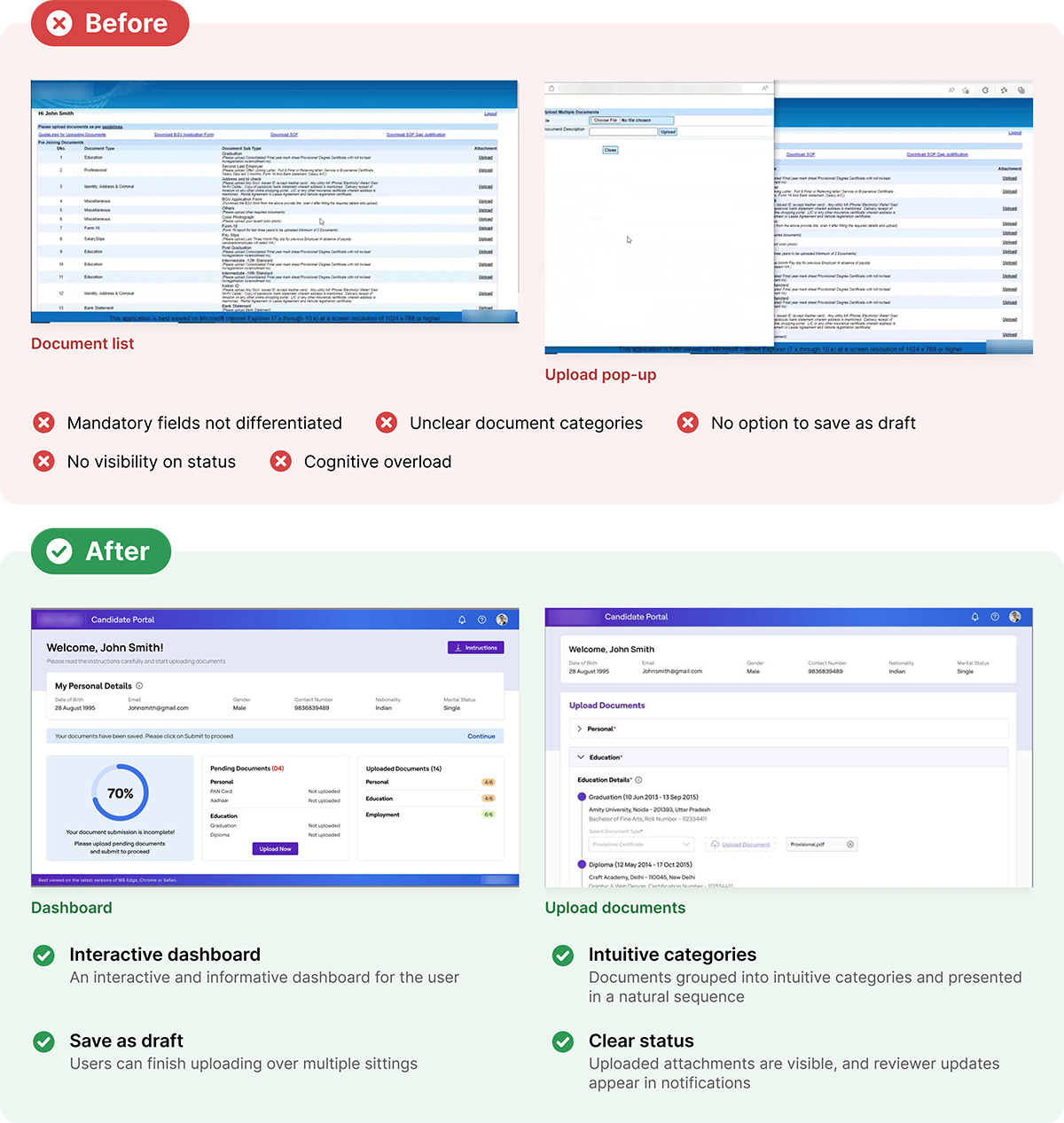
Mandatory upload fields not differentiated from optional fields.
Document category names were unclear - poorly categorised. For example, some users did not know what to upload in the “Miscellaneous” section.
No option to save as draft.
No visibility on the status of their application.
Overcluttered interface - increases cognitive load.
If the user is required to re-upload a document, he is told over email. There is no visual feedback on the portal that highlights the document that needs to be re-uploaded.
The workflow often spilled over onto a mail trail (see point above) instead of the whole process staying within the confines of the portal.
Key Observations

All users preferred using their laptop to upload documents on the portal. Some didn’t even know the mobile was even an option.

Around half the users cited that they would prefer to complete the uploading process over multiple sittings since they often don’t have all the required documents at hand.
Ideate
User journey
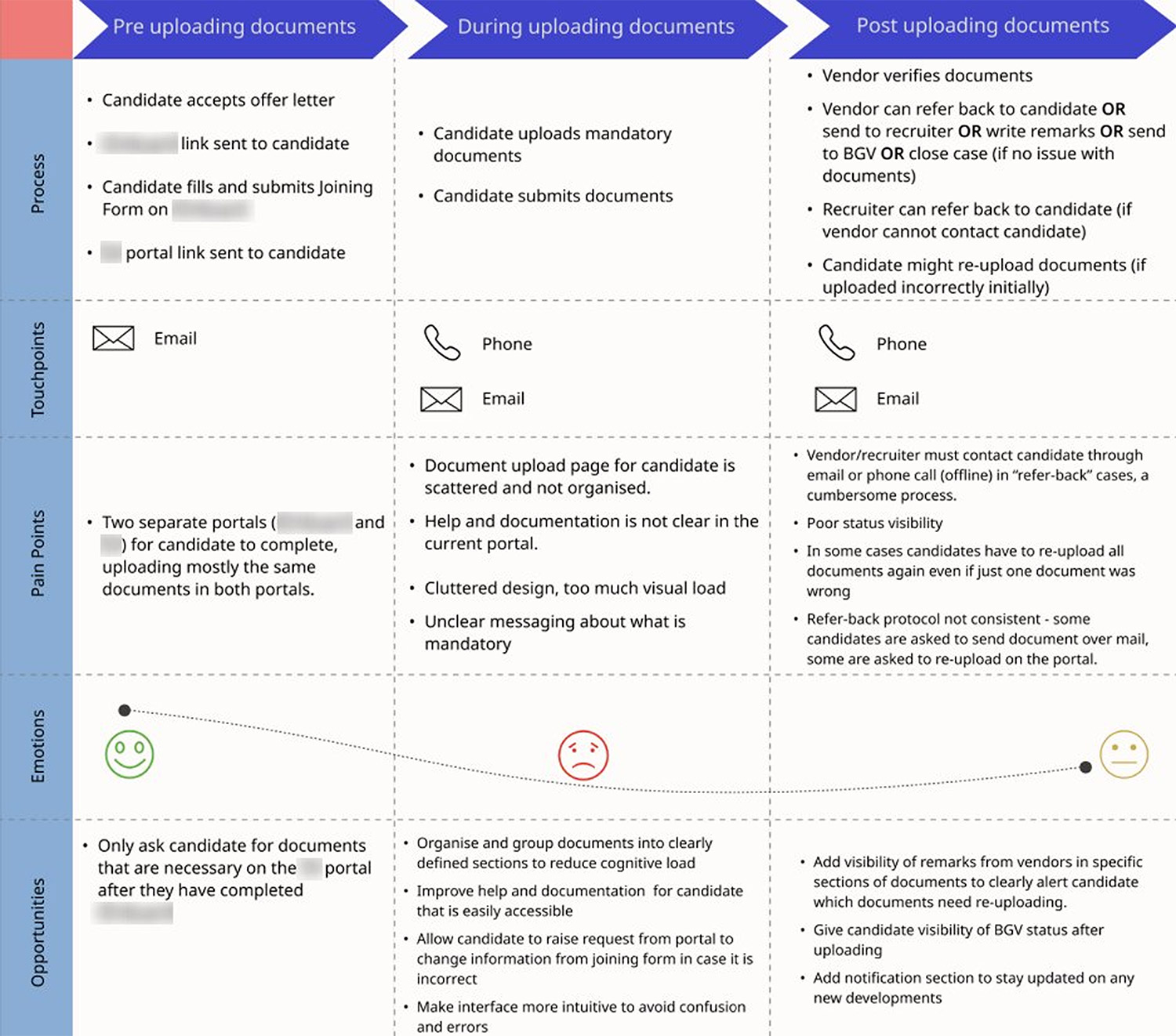
Based on the user interviews, having understood all the user touchpoints throughout their journey submitting their documents, a user journey was created to give us a holistic overview.
User flow
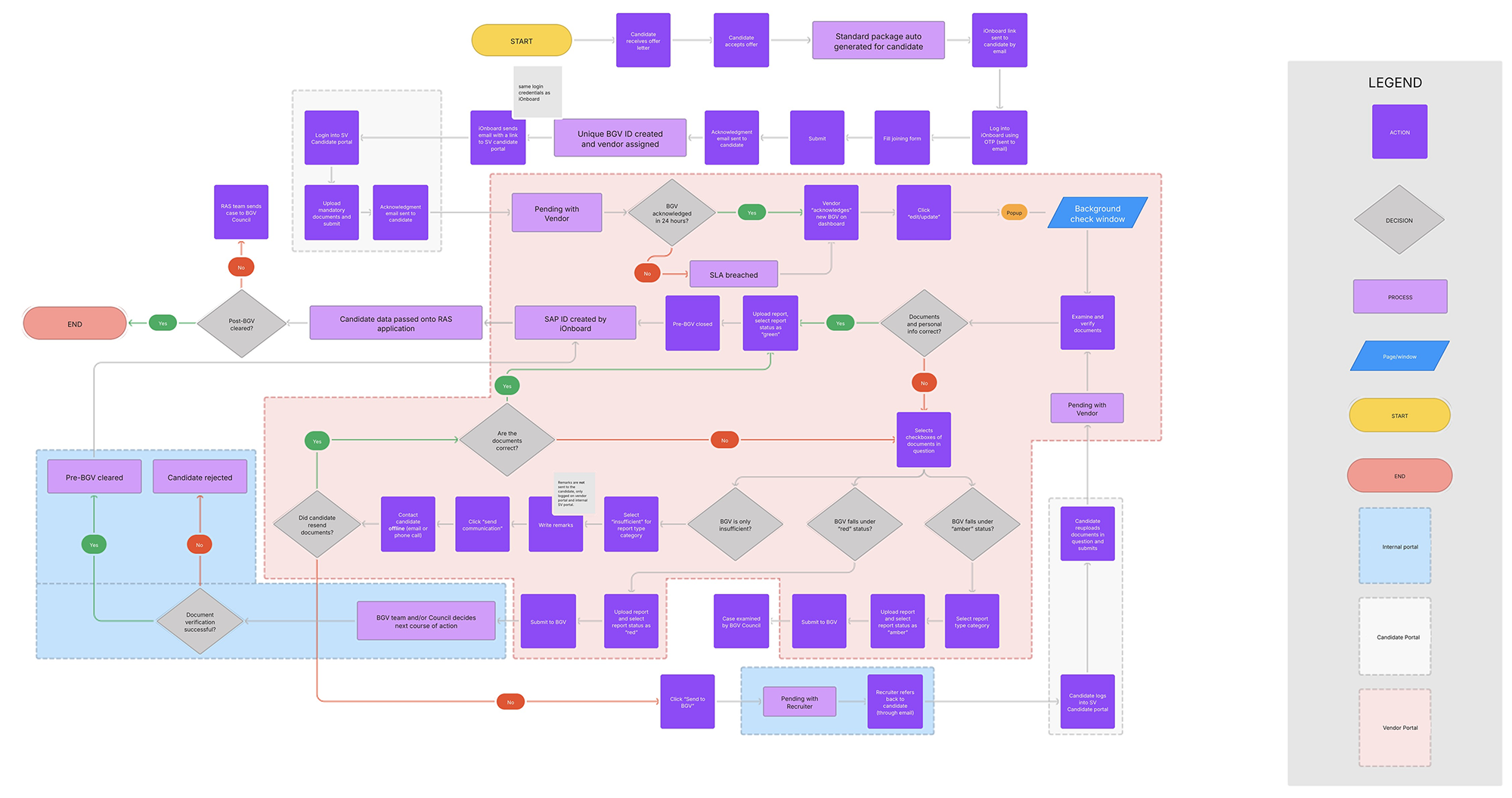
A user flow chart was created to map the entire background verification lifecycle of one employee. This helped us understand the following:

Communication over mail is done at multiple steps, increasing the chances of miscommunication.
The candidate’s application is passed on to multiple actors in the BGV process. The more people you have involved in a process, the higher the likelihood for 1) miscommunication and mistakes, and 2) Delays
Wrong or incorrect documents can cause a delay in onboarding of anywhere between 12 to 24 hours.
Note the various steps a single application takes and all the different scenarios it can go through depending on the quality of the submission. There was a lot of potential to cut some of these steps out of the process entirely.
Design
Wireframes
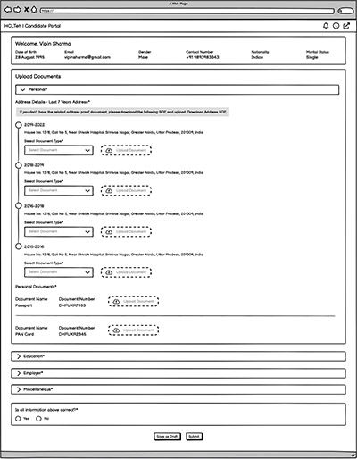
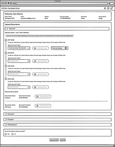
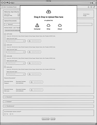
Based on my findings, I created wireframes to present to the client (the HR department) for feedback.
Revamped UI
The final UI was designed by the dedicated UI designer on the team. After some minor feedback from the wireframes was taken on board, the high fidelity screens were ready for UAT. The key changes are called out next to each screen below.
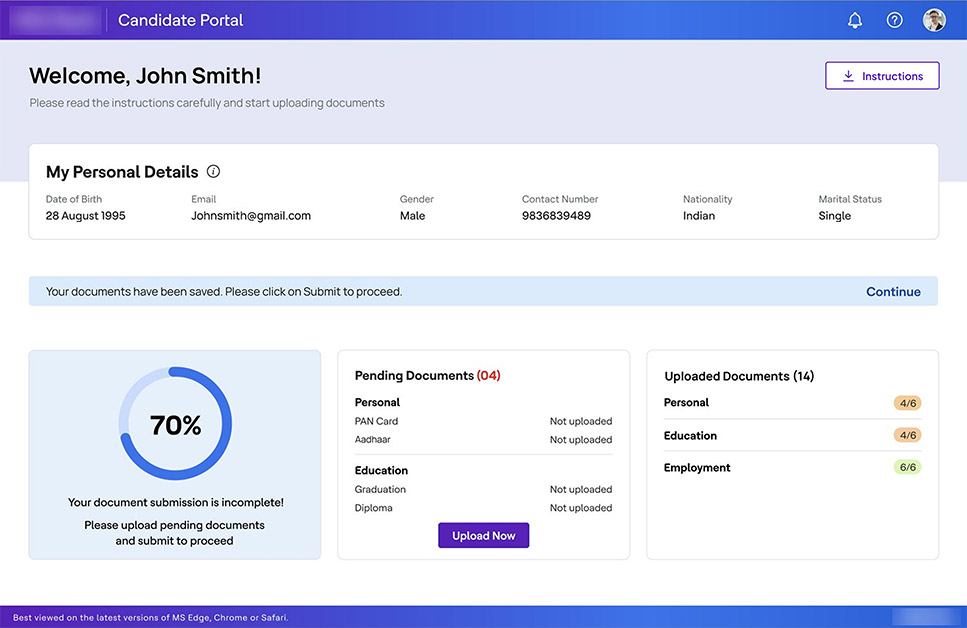
Interactive and informative dashboard for the user with a clear course of action.Interactive and informative dashboard for the user with a clear course of action.
Updates or comments from the reviewer will appear in the notifications section (the bell icon).
Instructions aren’t hidden away in a menu and can avoid the user having to reach out to their recruiter for assistance.
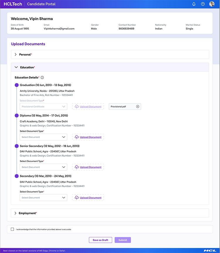
Documents grouped into intuitive categories.
Documents presented in a natural sequence according to users’ mental model based on similar forms in the digital world.
Uploaded attachments shown for user’s visibility.
Save as Draft feature added.
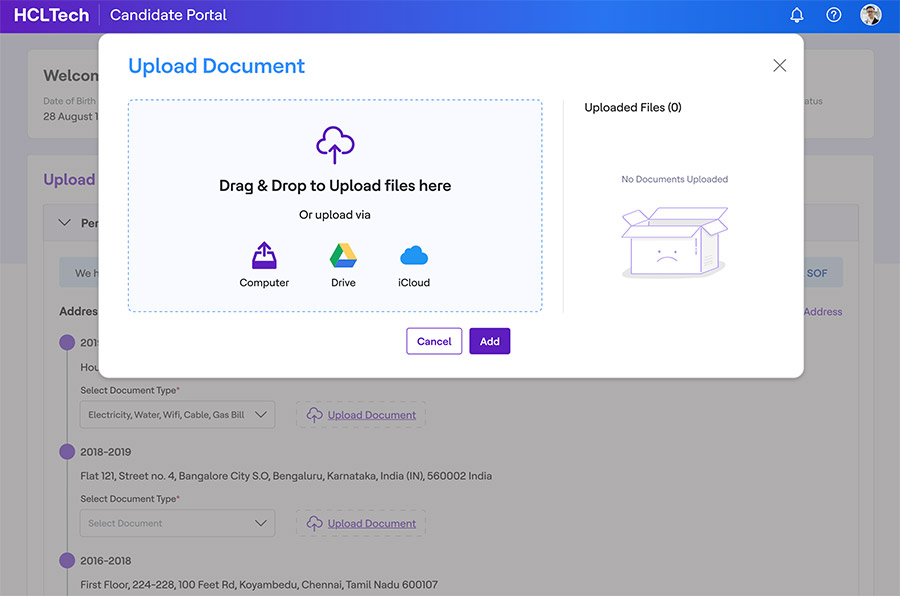
Multiple file upload channels provided for user flexibility, including a drag and drop feature for easy bulk uploads (this was often the case for receipts etc).
Outcome
Multiple file upload channels provided for user flexibility, including a drag and drop feature for easy bulk uploads (this was often the case for receipts etc).
This wasn’t down to UX alone, as the project was part of a bigger tech push that also improved the backend. But a big part of the saving came from cutting out the back and forth. Before, when HR sent a document back because it was unclear or wrong, candidates struggled to re-upload it on the portal and emailed it to their recruiter instead. The recruiter then forwarded it to the HR team, who often couldn’t review it the same working day, which pushed everything to the next day. This is the delay of up to 24 hours that the user flow had uncovered. With the new UI, the whole exchange happened on the portal, which made it quicker for both sides.

12 hours faster
The average cycle time for the whole onboarding process went down by 12 hours.

82% CSAT
Six weeks after the revamp, the portal had a customer satisfaction (CSAT) score of 82%.

Recruiters out of the loop
Candidates contacted recruiters less, so the process became mostly one-to-one between the candidate and the internal background verification (BGV) team. This freed up recruiters to focus on other tasks.
Designing with enterprise constraints
An internal tool at a company of this size comes with its own rules of the game. These constraints made some parts of the work harder, but they were also some of the most interesting problems on the project. Learning to work with them, rather than against them (while at times infuriating), made me a more resourceful and adaptable designer.

Getting approval: Nothing happened without sign-off from another department or a senior member of the team, and the approval chain was long. Even a small copy change could take ages. Changes to what data we showed, or didn’t show, needed extra scrutiny: after cyber attacks in the past, the company follows very strict data protection rules.

A fixed design system: The design system and guidelines had to be followed strictly, with little to no room for flexibility. New projects weren’t a chance to shape the guidelines either, as the company is wary of changes to its design language for brand and PR reasons.

Mandatory steps: The portal sits inside an enterprise process full of steps that users have no choice but to take. The user flow above shows just how many steps and parties were involved. The product team had very little wiggle room to shorten the process, so the UX had to work within it. Since we couldn’t remove lots of steps, the design focused on making each one clearer: grouping documents, showing their status, and letting users save a draft and come back later. This made good solutions harder to find, but it also pushed me to think creatively.

Presenting to senior stakeholders: As the researcher, it was customary for me to present the findings from all my studies (interviews, user flows and more) in a deck to senior stakeholders. These included the CIO and members of the Business Transformation vertical, which the design department sits under. The deck had to justify the need for a revamp. Once the revamp was complete, we presented another deck showing how the design addressed each of those challenges.