This boutique homestay sought assistance in developing a cohesive brand identity, including a logo, brand colors, and an engaging website to establish a professional first impression, enhance brand awareness, and drive inquiries and bookings.
Currently, their villas are listed on third-party platforms such as Airbnb and Tripadvisor, but they lack a dedicated website to showcase their full range of accommodations and offerings. Additionally, the business recently launched an Instagram page and required promotional and marketing materials tailored for social media to amplify their online presence.
Brand Identity Design
Colour palette
Typography
Logo
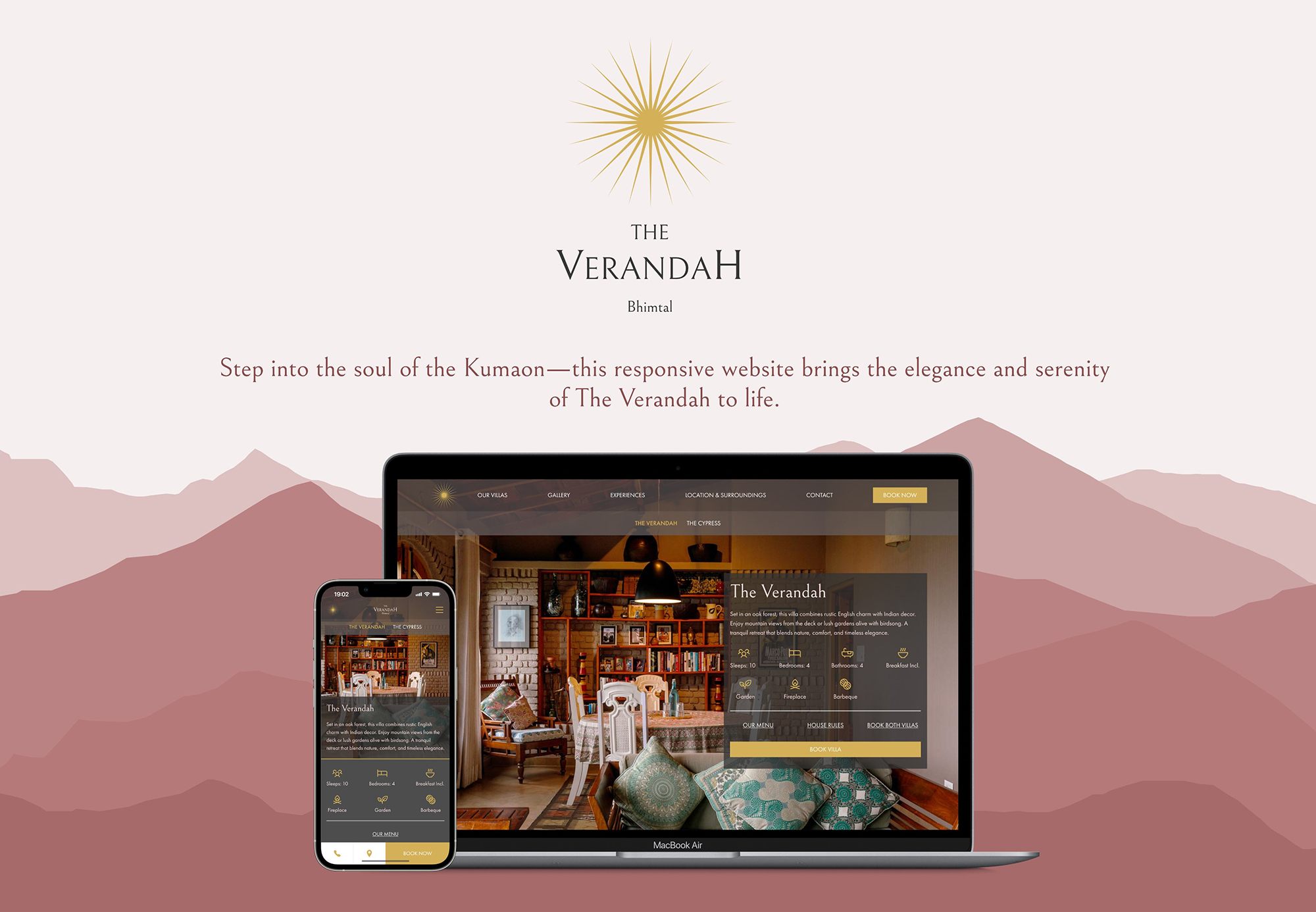
Responsive website
Miscellaneous Design Collateral
Food and Beverage Menu Design
House Rules
Instagram promotional post
Process
01
DISCOVER
& DEFINE
User Interviews
02
IDEATE
Moodboard
Logo Design
Colour Palette
03
DESIGN
Desirability Test
Typography
Prototype
Discover & Define
User Interviews
The client’s homestay is a high-end (but not quite luxury) property with high quality services and amenities. Based on the client’s user demographic (their past guests) and the tariff as compared to competitors in the region, the overall brand will be best suited to aim for a high-end, boutique aesthetic that matches the expectations of customers who will be interested in staying at a place like this. However, to confirm this hypothesis and understand our target user group better, I conducted informal interviews with past guests who had left positive reviews of the homestay.
Number of users: 5
Sampling – I reached out to 5 past guests who had left positive reviews on booking websites such as Airbnb and Tripadvisor. This is because I wanted to ensure that my client’s brand direction was in line with customers who enjoyed their stay at the homestay.
Objectives
Attitudinal
- To better understand the kind of hospitality experience the target demographic expects at the client’s property.
- How they perceive the client’s homestay ̈
- Does it feel like a budget or luxury
experience. - Is it a tranquil, calming experience or is it more of a party spot?
- What are the kinds of activities they did while they stayed at the property?
- What was the highlight of their stay?
Functional/ Usability:
- What do they expect to find on a hotel’s website? What information are they looking for?
- Most groups that booked the property were large (between 5-9 people.
- Average length of stay: 3 nights.
- Found out about it on Airbnb, VistaRooms,
Tripadvisor, word of mouth.
Findings
Attitudinal
- Users liked the food, the décor, the warm and helpful staff, and the view the most.
- Highlights: The view (2), the deck (1), the
food (1), the rooms (1) - Adjectives: Warm, elegant, heavenly,
tranquil, cosy, amazing, classy, relaxing etc. - Most users considered it closer to a high- end establishment but not a 5 star hotel.
Usability
- UInformation that matters to users the most: Internet access, other amenities – pool, garden, play – table tennis, badminton, etc; food – breakfast included? Cost of lunch and dinner, cancellation policy; is it pet- friendly; distance from their location.
- All users preferred paying through third- party sites due to a sense that their money is safer with those websites; also users have prior experience in using those sites so they trust them more.
- Users are mostly interested in visuals – images, videos, anything that gives them a visual sense of the property, its rooms and interiors, and the surroundings.
Ideate
Moodboard
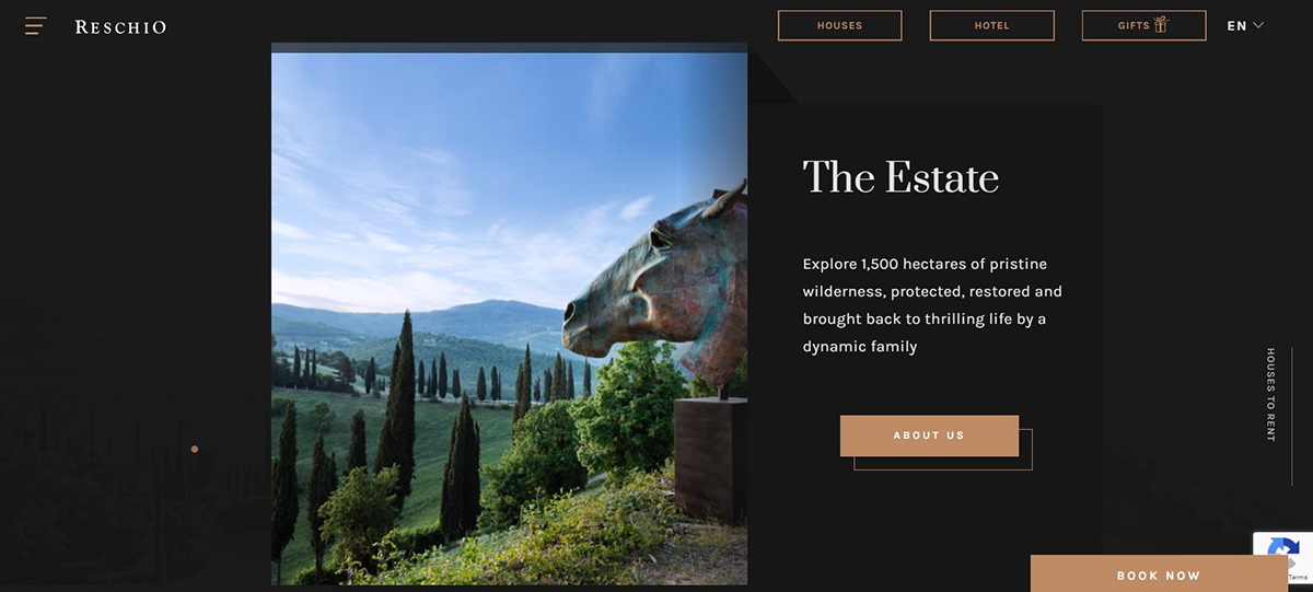
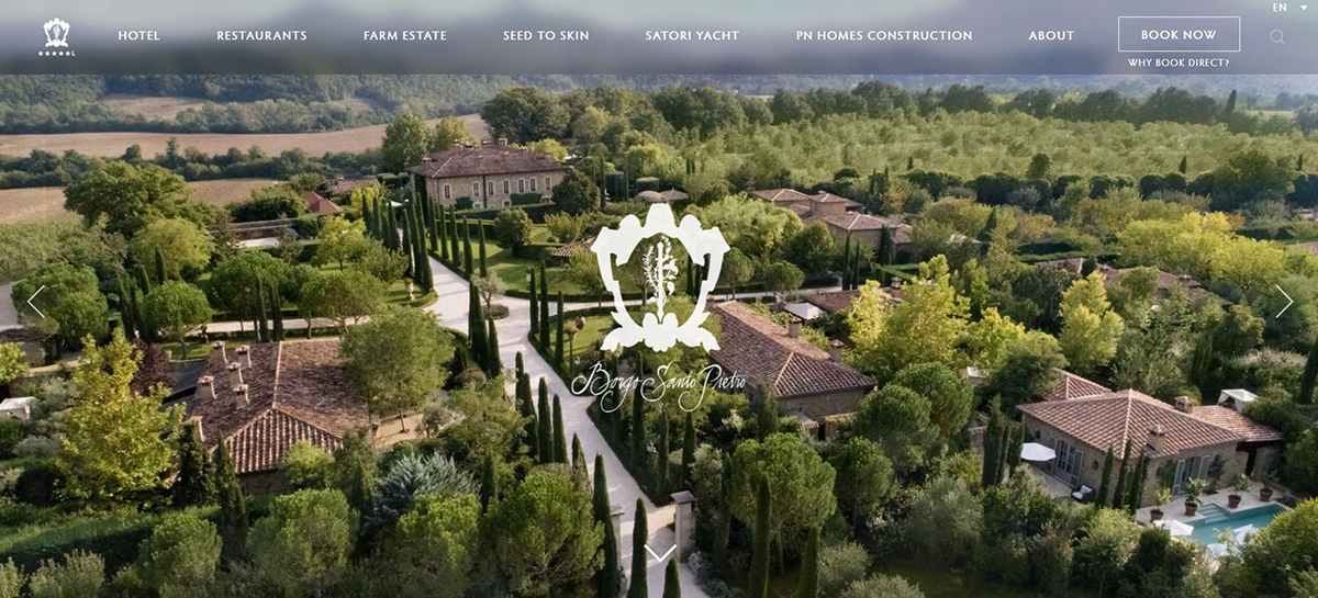
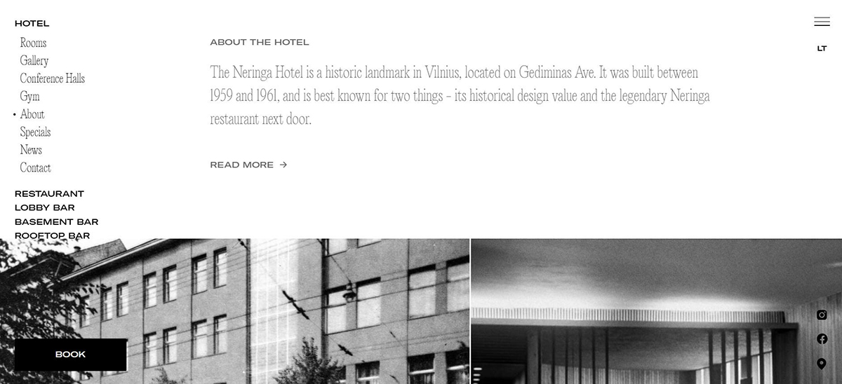
The interviews gave me a sense of direction for the brand. They helped me narrow the scope of the aesthetic I was looking for - small, boutique hotels and resorts with traditional, elegant décor. To get some design inspiration and to begin ruminating over the colour palette, typography and logo, I decided to create a moodboard with websites of resorts and country homes in places like Tuscany, Lake Como and Provence. Even though they would be much more exclusive than my client’s establishment, the subtle and elegant look would match what I was looking for. The moodboard had a mix of modern and traditional looking designs.
Logo Design
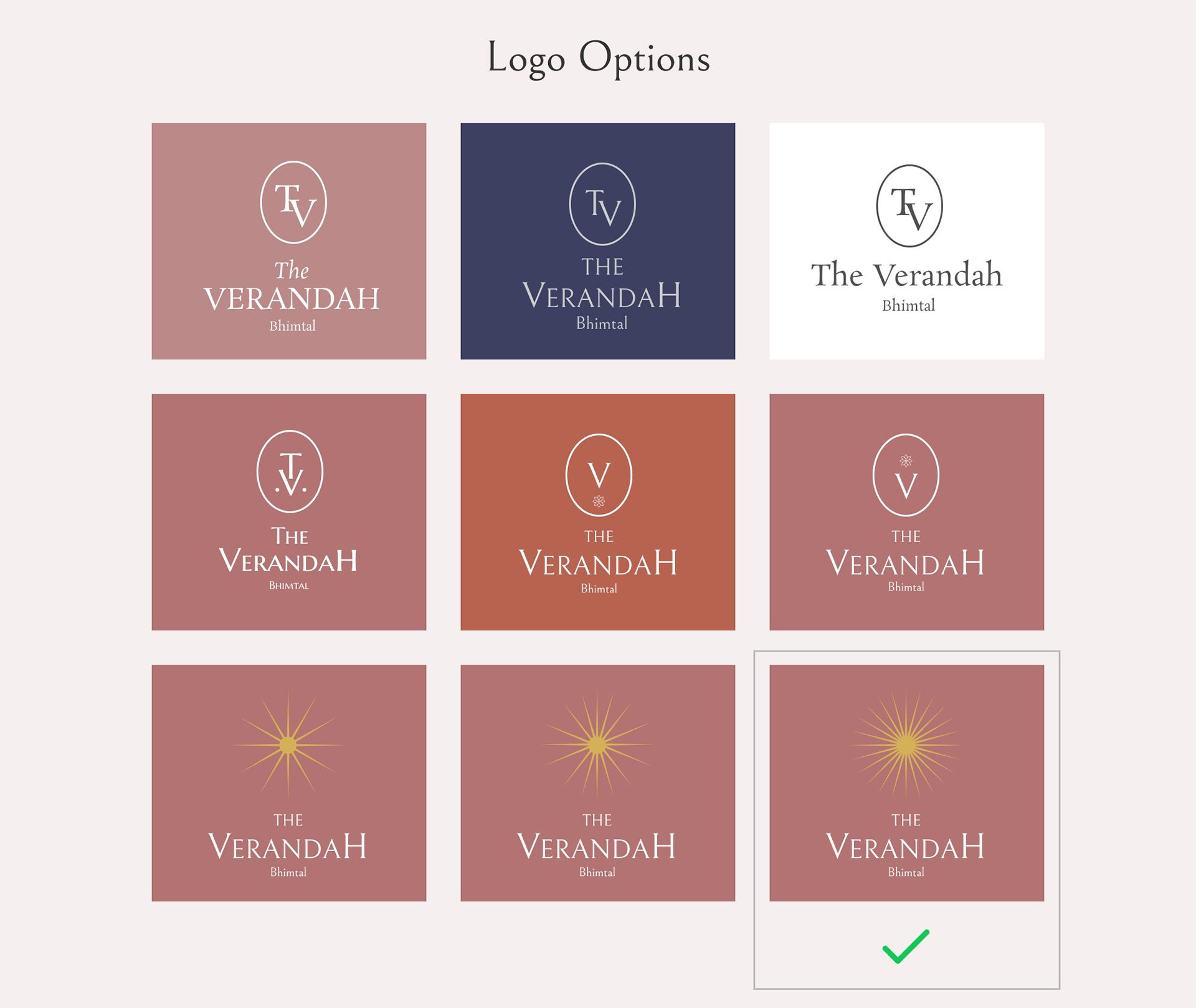
The client had given me some references of logo designs that they felt matched the “energy” of their establishment. They were looking for a minimalist, sophisticated design that one frequently sees at exclusive boutique hotels around the world. After eight attempts, we found our winner (see image). I went for a design that would be timeless and recognisable on its own, even without the name of the homestay underneath. This is because the logo would eventually go on staff uniforms, menus, and their instagram profile where real estate is limited and the name may not be able to fit. The sun embodies the nature of the landscape - one that receives plenty of sunlight throughout the year. It also alludes to the warmth of the helpful staff that take the utmost care of their guests and the property.
Colour Palette
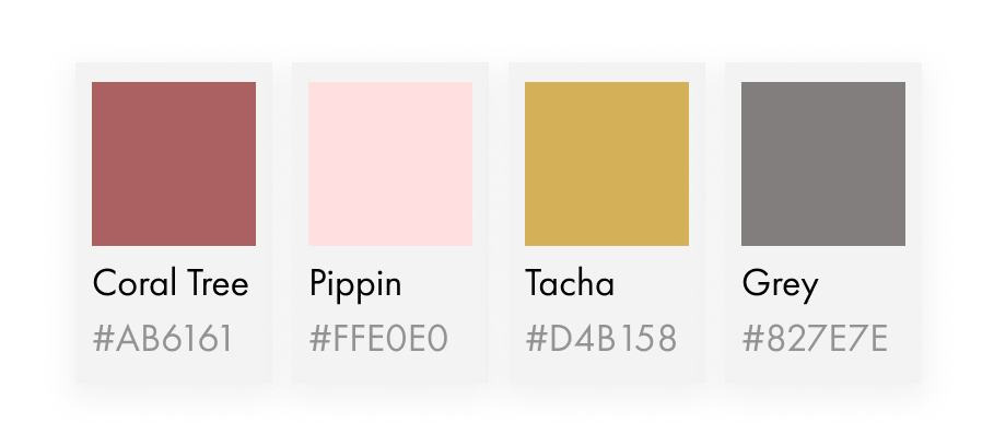
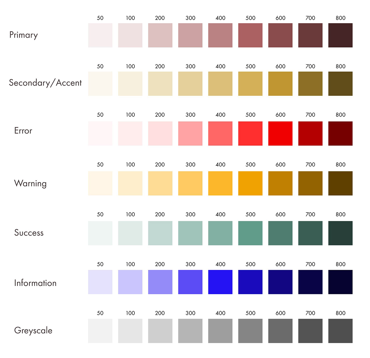
The first step towards creating a brand identity for the client was to define the colour palette. I suggested warm, earthy, yet elegant hues given the property's surroundings (oak forests) and the generous use of brick on the facade and teracotta in the outdoor decor. The primary colour was a burnt red/ teracotta (“Coral Tree”) and the accent colour was a warm gold (“Tacha”).
The full colour palette can be found in the gallery section at the end of this page
Design
Desirability testing
Having finalised a logo and decided the colour palette (open to changes during the design phase) I was faced with a dilemma. The moodboard contained two distinct design styles - modern and cutting edge, and traditional and elegant - both of which could work with my client’s aesthetic. To tackle this road block I decided to conduct a desirability test using a variation of Microsoft’s Desirability Testing Toolkit.
Initially I debated conducting the test with homepage designs from my moodboard, but I decided to create two relatively hi-fidelity homepage designs with the colour palette and logo we had decided to use. I believed using actual images of the property and its name on the two design options would lead to better immersion for the test participants and would help them visualise and compare the client’s property against both design options.
Experiment design
Participants: 10 in total (two cohorts of 5 participants – Past guests and random users). For convenience, User group 1 will signify the “past guests” group which comprises of people who have previously visited the client’s resort; User group 2 will be used for the group of random users who have had no prior interaction or knowledge of the resort.
Bear in mind, “random” users were volunteers who lived in Delhi and were screened to ensure they fit our target demographic’s age range. However, there was not enough time and resources to do a thorough screening to ensure randomness in the second group and recruit more than 5 users per group.
Design variant A: A traditional, safe design option with visual harmony and symmetry.
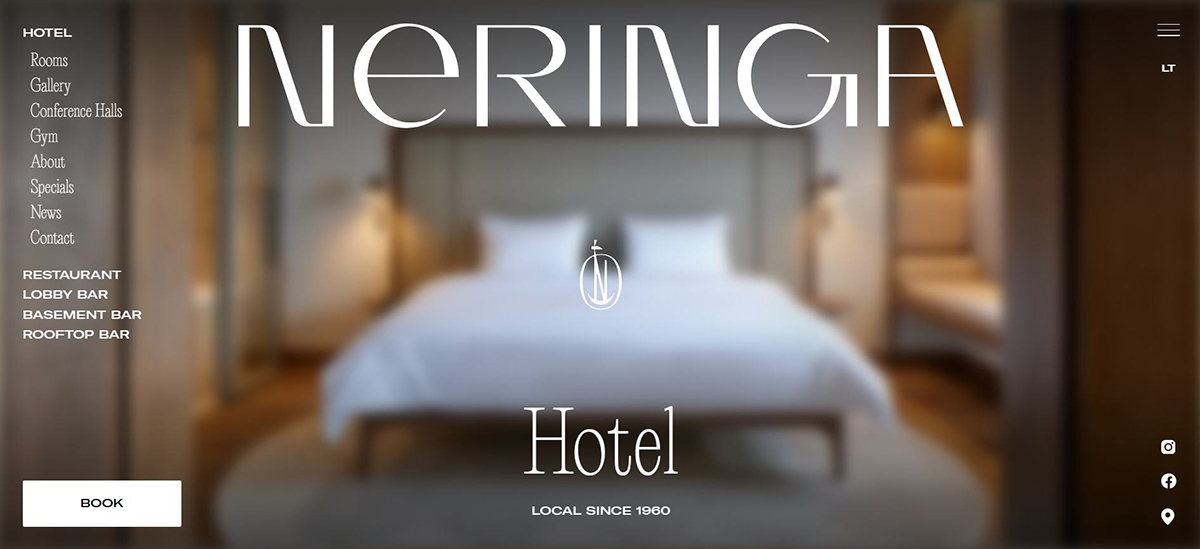
Design variant B: A modern, cutting-edge design with an unconventional approach.
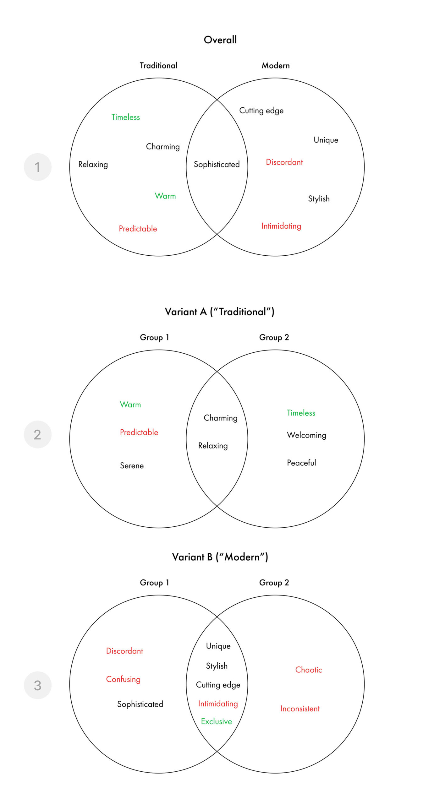
Method: 30 words were carefully chosen, of which 18 (60%) were positive and 12 (40%) were negative as is best practice. Out of the positive words, words highlighted in green aligned with the client’s brand image goals. The word list went through some iterations after taking feedback from my peers, using AI, and doing some secondary research to ensure the words chosen were, for the most part, construed by society as definitely positive and definitely negative. Since usability was not being tested, words pertaining to usability were not included.
Positive words:
Sophisticated, Charming, Serene, Luxurious, Cutting-edge, Authentic, stable, Easy-to-use, Wholesome, Timeless, Warm, Relaxing, Welcoming, Peaceful, Stylish, Unique, Thoughtful, Exclusive
Negative words:
Outdated, Inconsistent, Overpriced, Impersonal, Crowded, Predictable, Bizarre, Chaotic, boring, Discordant, Confusing, Intimidating
Participants from each group were shown both design variants and were asked to select 5 words that best describe each design option. I randomised the order in which the words were presented as well as the order in which the designs were presented to minimise order bias. After each participant selected the words from the list, I did a quick post-test interview probing them on why they selected those words to extract the “why”.
Finally, I tallied the number of times each word was selected and ordered them by most-selected to least-selected (as percentages). Venn diagrams were made to compare the responses from the two user groups by looking at the top 5 words chosen by each group (see images below).
Post-test Interview Summary
Variant A (Traditional)
- Words like “timeless,” “warm,” and “relaxing” were selected because users felt the design looked simple, familiar, and similar to other websites for hotels, spas, or restaurants.
- The font was considered a safe choice yet readable and pleasant, and the testimonials added a sense of trust and reassurance.
- “Predictable” was used to describe the layout, as users found elements where they expected them (e.g., “book now” CTA, navigation links, and contact sections). While some saw this predictability as a neutral or slightly negative trait, others appreciated its familiarity. Nonetheless, the two users who had selected the word “boring” also cited the predictable and safe nature of the interface making it appear lacklustre in their eyes.
Variant B (Modern)
- Words like “unique,” “stylish,” and “discordant” were commonly selected. User group 2 viewed the design more favourably, associating it with edgy boutique fashion websites and thus calling it “exclusive.” However, most of user group 1 felt the design did not match the homestay’s traditional brand image, suggesting it would better suit a hotel chain with a modern building and décorn
- Some user group 2 participants also noted the design didn’t align with the homestay’s aesthetic after seeing images of the property, though this feedback was less frequent.
- Words like “confusing” and “chaotic” highlighted usability concerns. Although the test focused primarily on visual appeal, users felt the design appeared less intuitive and user-friendly at first glance, adding to its perceived flaws.
Typography
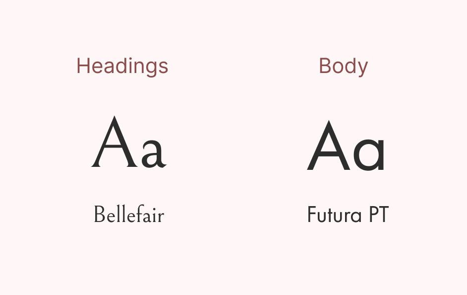
Having decided on going with a more traditional design for the website after the results from the desirability test, I could then flesh out the typography. I wanted a mix of modern and traditional to maintain a balance between the brand's traditional and elegant image with a clean website. As a result, I decided to keep the font combination I used in variant A of the test - Bellefair (serif) and Futura PT (sans serif). Futura is great because its pleasant, versatile (many weight variations) and readable.
For the scale I used major third.
Final Prototype
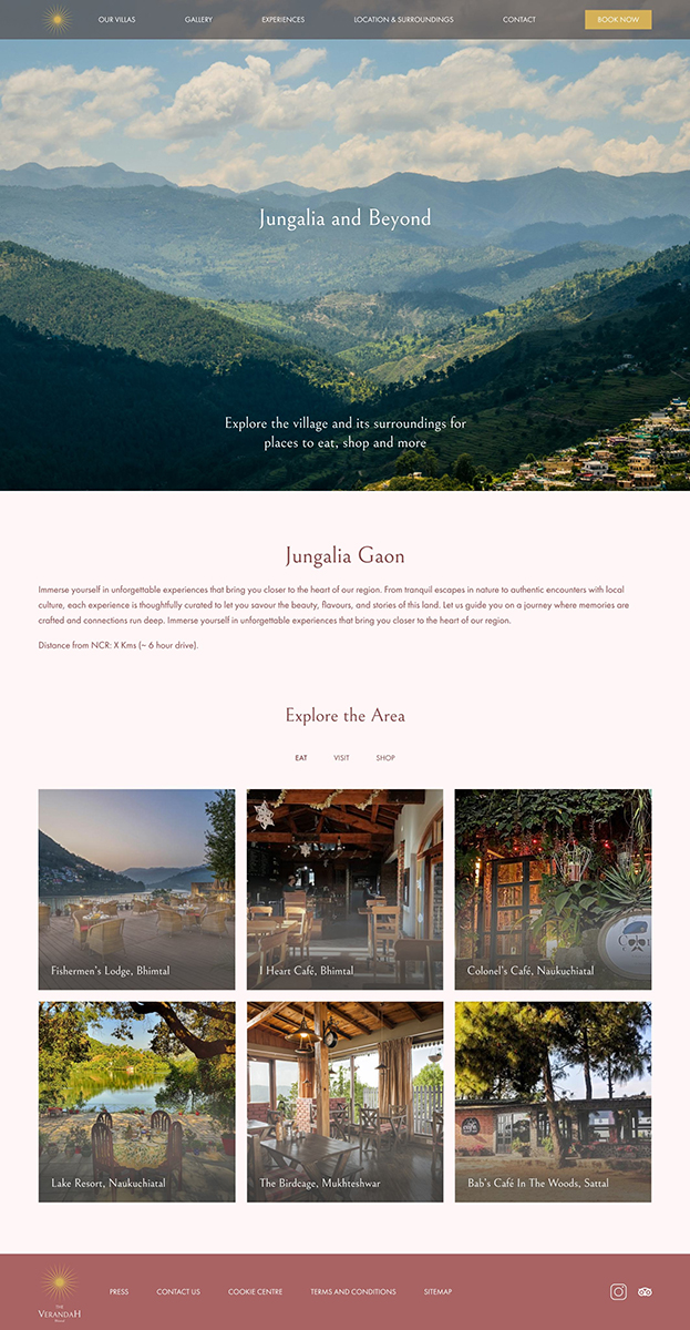
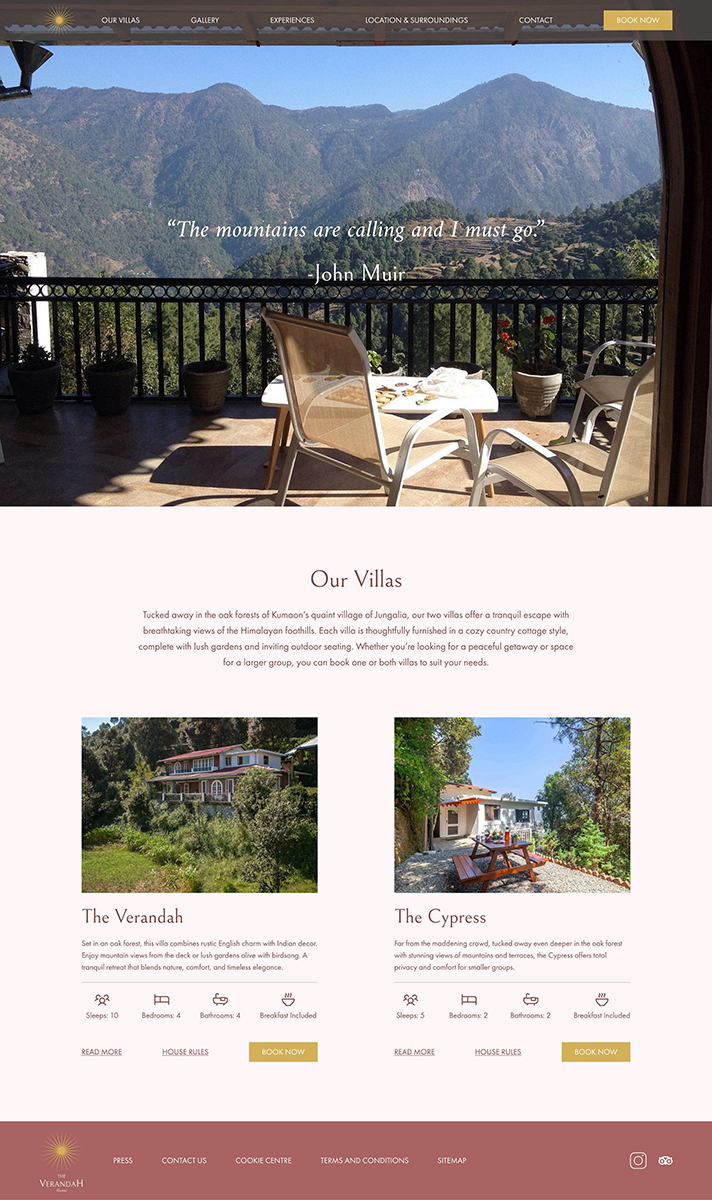
With some further iterations to the design after feedback from the client, the design was finalised and a prototype was created for the desktop, tablet, and mobile.
Menu Design
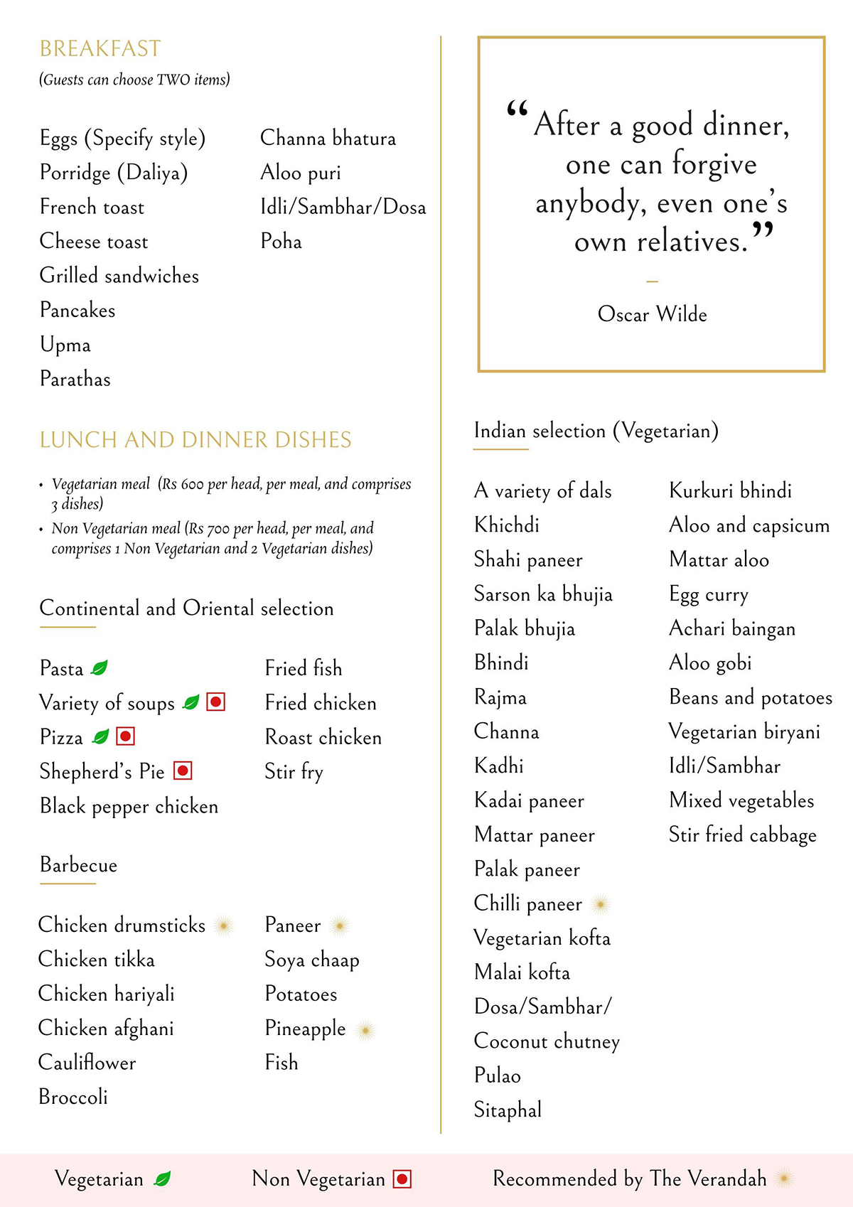
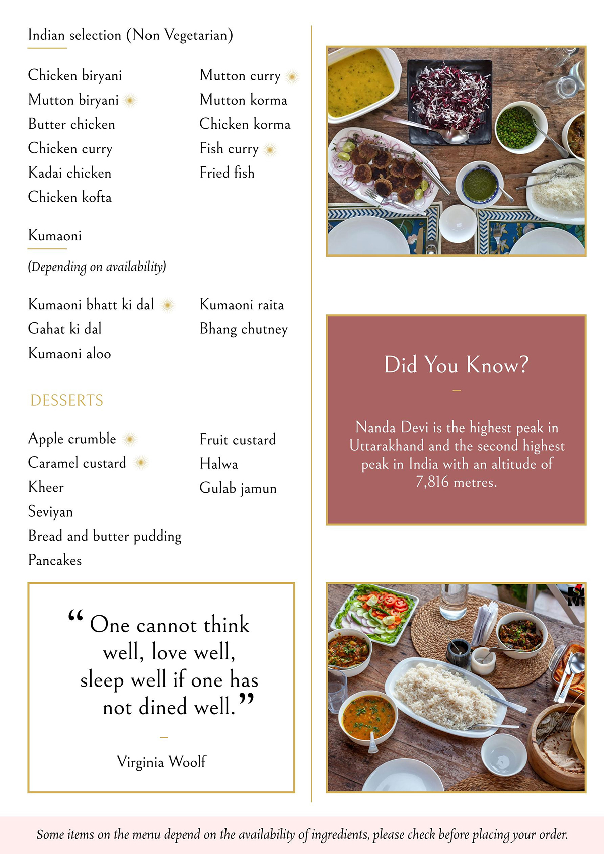
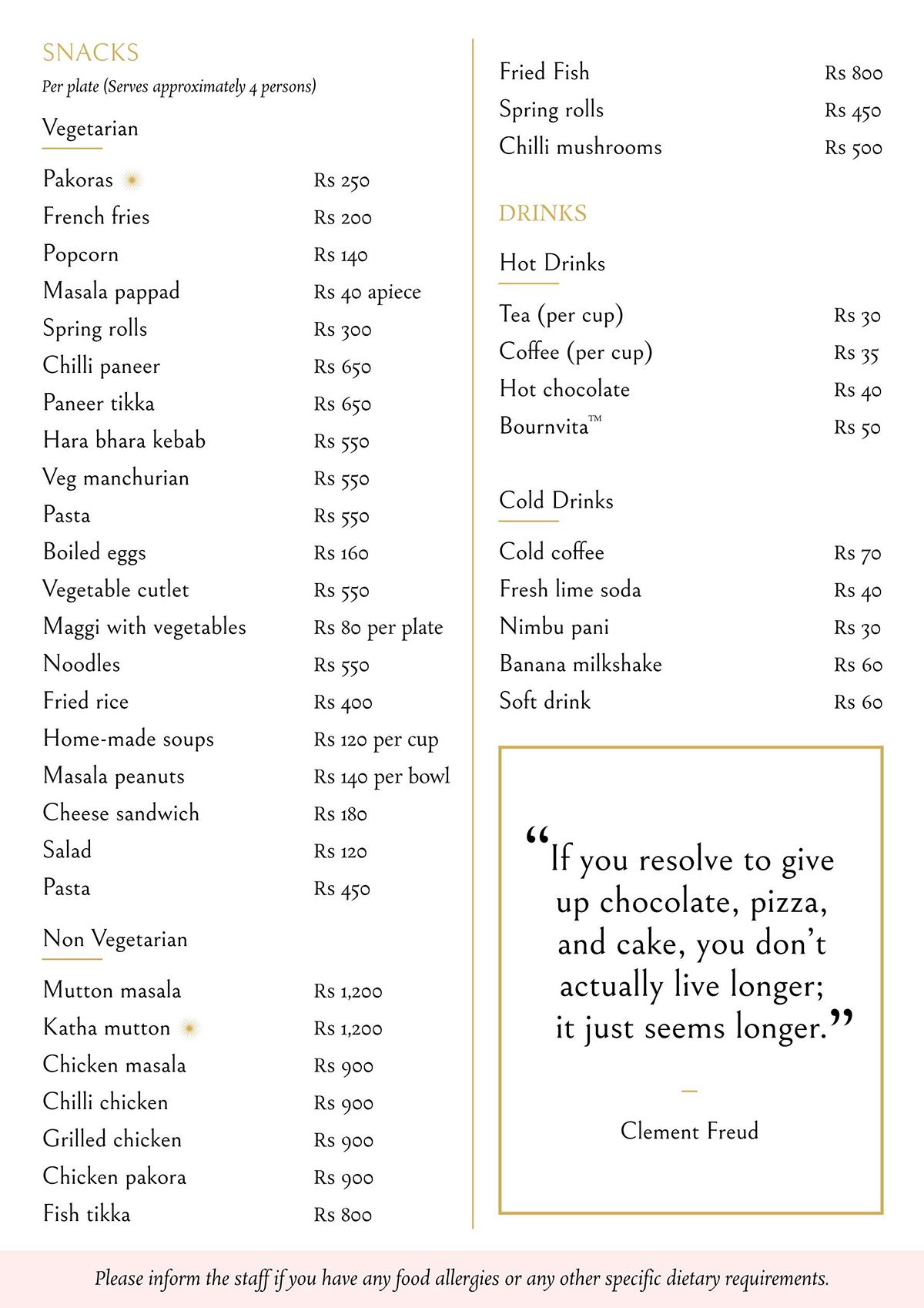
The food and beverage menu was designed in a way that was visually consistent with the website. To tackle the problem of too much empty space and to ensure the menu was limited to 3 pages, I added pictures of food served at the boutique resort as well as a fun fact to make it more engaging. Some final touches are mentioned below:
- An allergy warning was added at the footer.
- A legend was added to the footer to highlight vegetarian, non-vegetarian, and items
“Recommended by The Verandah” that are guest favourites. I symbolised the “Recommended” dishes with the brand logo.
Gallery

