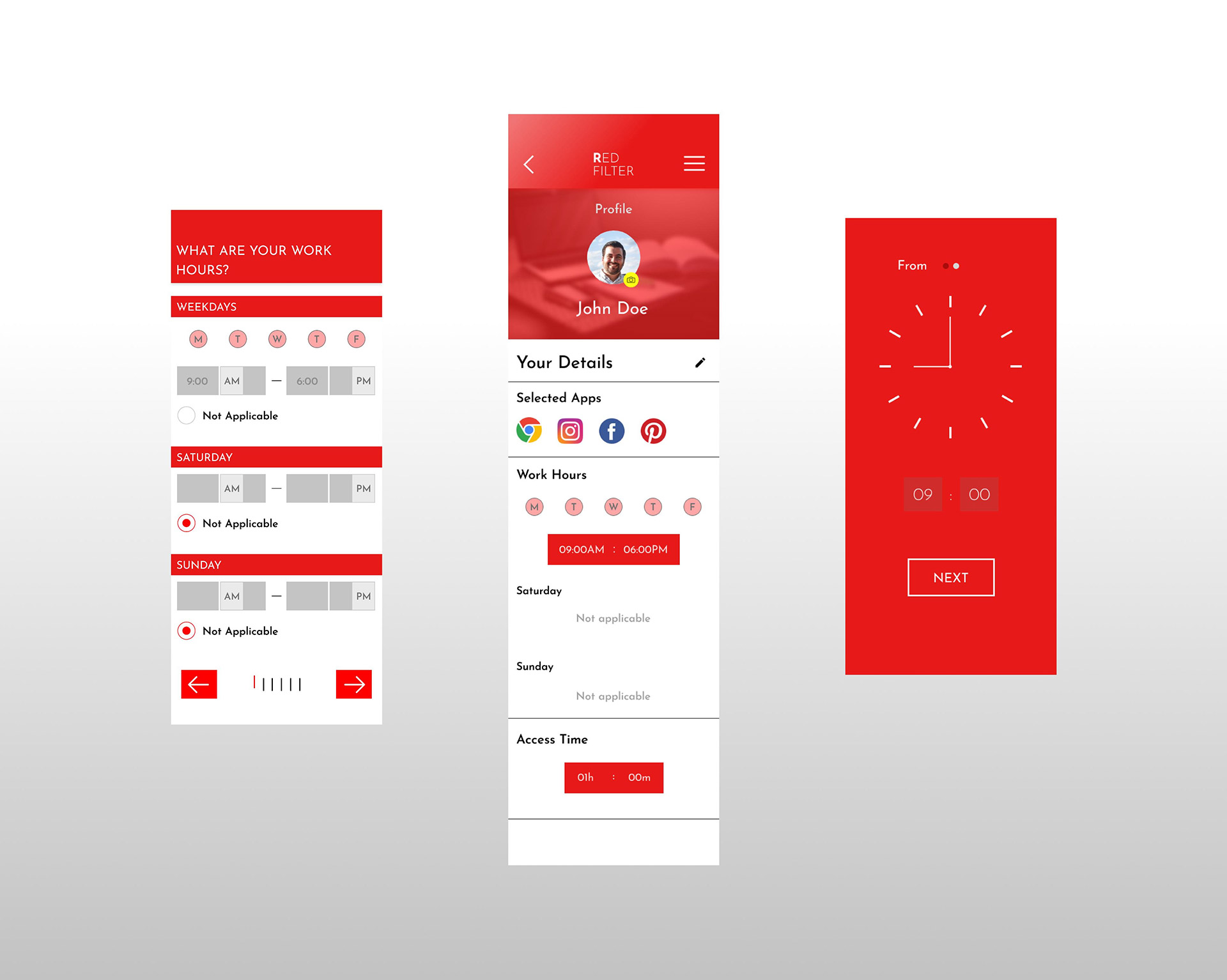
As part of the Interaction Design specialisation by the University of California, San Diego, the final capstone project requires students to design a mobile app based on one of the following themes - 1) Time 2) Change 3) Glance. I chose to base my design on the theme of “Time”.
Process
01
DISCOVER
& DEFINE
Interviews
02
IDEATE
Brainstorming
Moodboard
Storyboard
Wireframes
03
DESIGN
Heuristic Evaluation (self)
Prototype
04
EVALUATE
User test
Iterate and redesign
Discover & Define
Interviews
The area of interest for this project is around procrastination and distraction during work. I wanted to observe the reasons why my users procrastinated and got distracted, if at all, as well as their mechanisms and strategies to overcome them. The task given to my interview subjects was to do a piece of work that they are least looking forward to doing (i.e. Work that they are avoiding doing or are least focused when doing it) for a few minutes while I observe them through my laptop webcam, and then tell me the methods they use to stay focused and stay on track with work. My findings found that most methods used to counteract procrastination are not very effective, giving scope for improvements.
One interviewee has ADHD (marginalised user).
Objectives
- Try to understand why people are doing things the way they are.
- Observe the successes, breakdowns, and latent opportunities that occur when devices are used, not used, or could be used to support your chosen activity. Are there existing solutions that people aren’t using? If so, why?
- Take pictures of breakdowns and/or design opportunities.
Findings
- Smartphones and laptops are major distractions.
- Users rely on smartphones for work breaks
- Relaxed deadlines and dull tasks promote
procrastination. - Separate work devices don’t prevent
leisure-related multitasking. - Co-working spaces reduce distractions;
WFH increases them due to less
accountability.
Ideate
Brainstorming
At this stage, I brainstormed ideas based on interview responses and observations, framing them as "user needs" to address pain points. Here’s the list of ideas phrased as "Users need ...":
- Users need a way to avoid using their personal phone and laptop while working.
- Users need to find a way to avoid or limit using social media during work.
- Users need a way to be able to change their music/podcasts while working without getting carried away.
- Users need a way to stay stimulated while working on boring/drudge work.
- Users need an incentive to do boring work or work that has relaxed deadlines.
- Users need a way to work on a decluttered screen without losing important information.
- Users need to be able to keep personal deadlines on work items that have no fixed deadlines.
- Users need to be held accountable for failing to keep their own deadlines.
- Users need to find a practical and more effective way of turning off distractions from their phone than manually switching off their Wi-Fi, turning off their phone, or turning on Do Not Disturb.
- Users need to find a way to feel motivated in order to be productive.
Moodboard
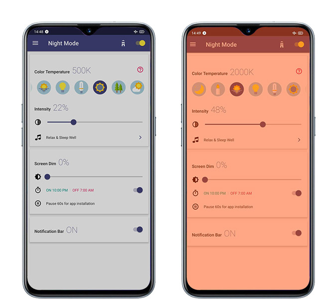
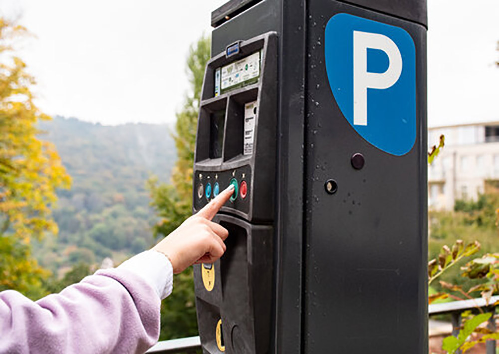
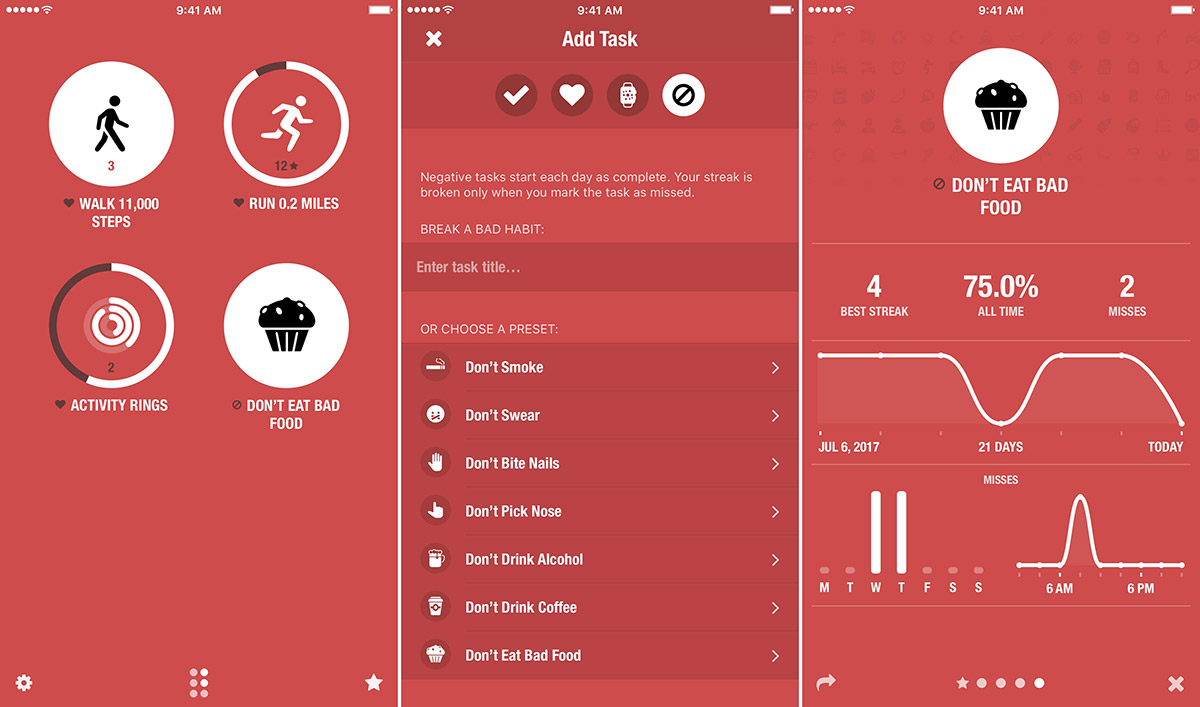
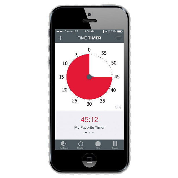
The following mood board are a collection of images, ideas, and concepts that I took inspiration from during the ideation phase of designing this app. Each item on this mood board gave me a unique perspective on approaching user needs in terms of procrastination and distraction.
App Idea
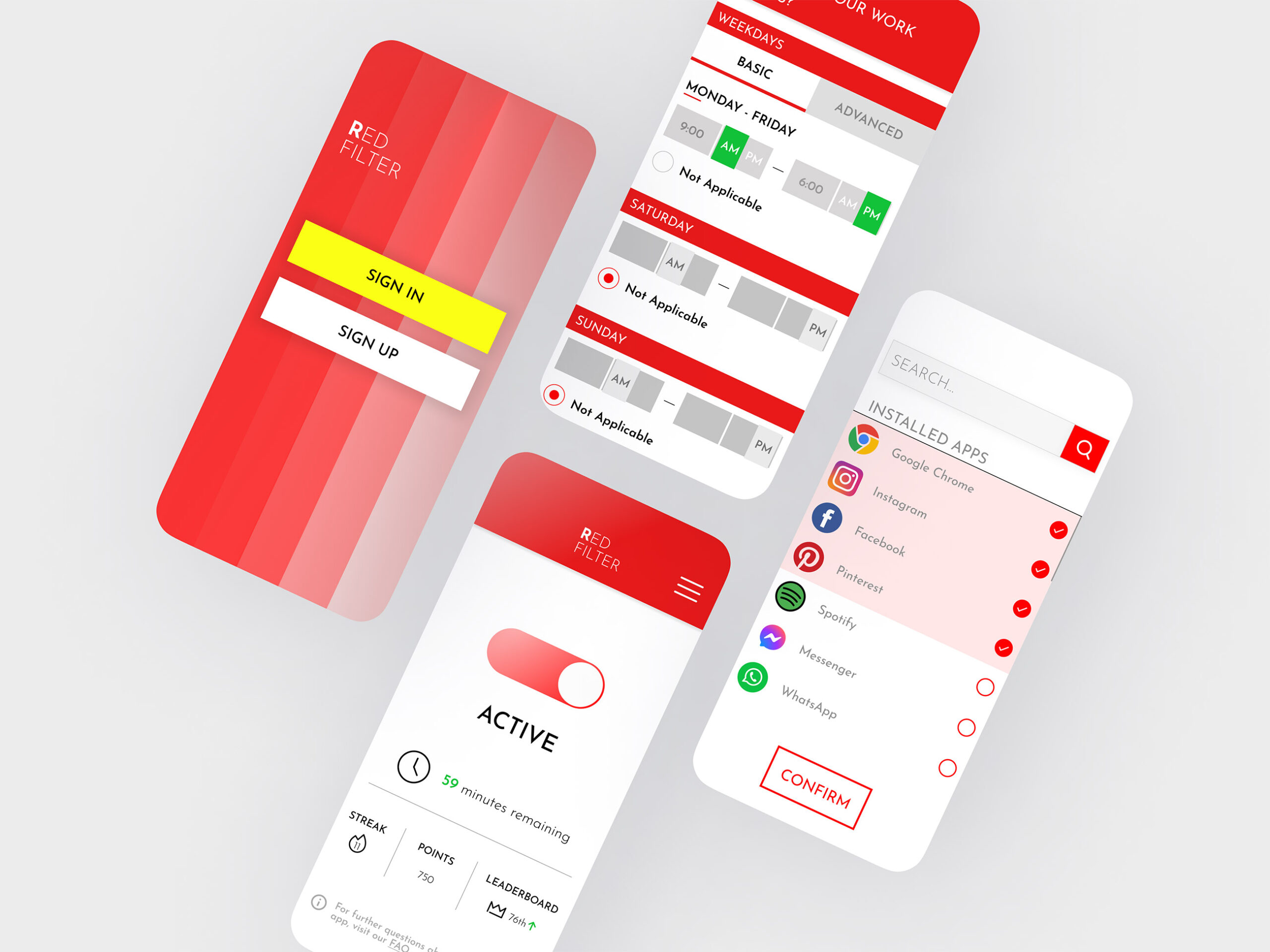
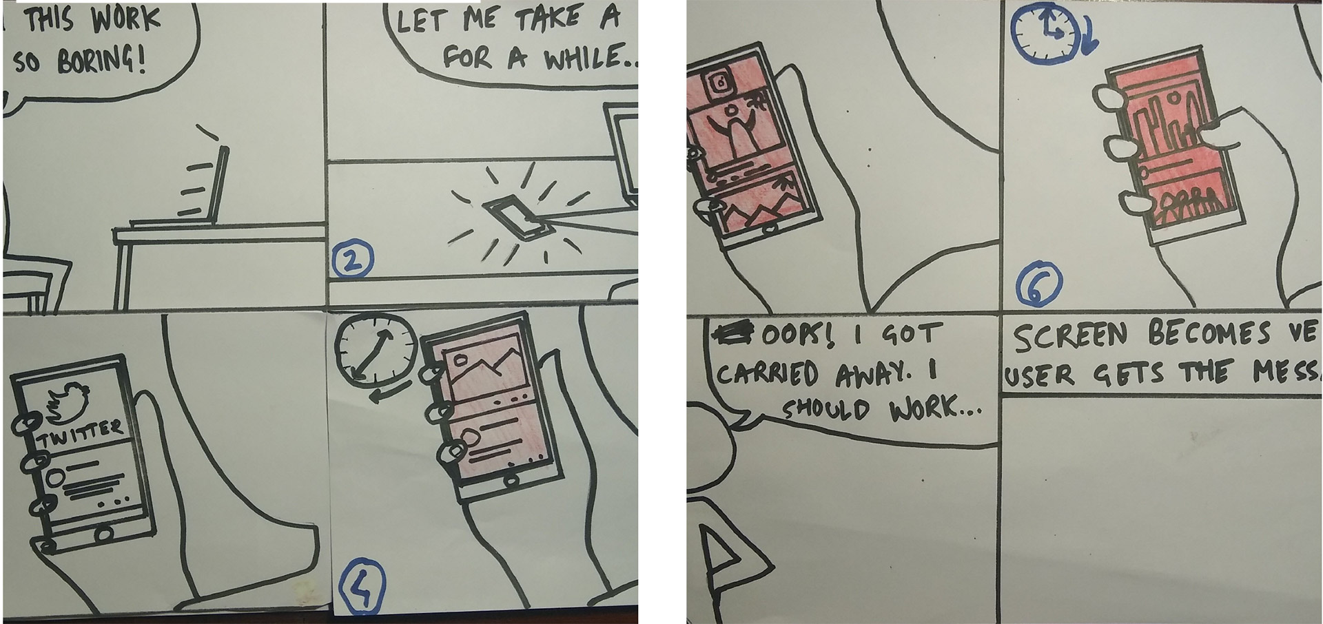
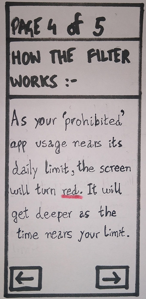
The more time you spend on distracting apps on your phone, the phone screen starts turning red as a soft signal for you to stop. If you override it (which you can, with a cost) then the app will prevent access to the app completely for 3 hours, as well as docking points and ending your streak. If you don’t override it, you will be allowed to access the websites for a period of time (set by you) until it starts to turn red again.
The reason I went with this idea is that unlike other ideas to tackle smartphone procrastination that I have come across, I believe this app will be subtle as well as assisting in developing better habits by using a visual cue (the red filter) to encourage positive behaviour patterns (putting down the phone and getting back to being productive). I want the app to run in the background and seamlessly function with a user’s smartphone interactions rather than serve as a jarring blunt force tool that jolts the user into correcting an action (rather like an industrial sounding iPhone alarm).
Storyboard
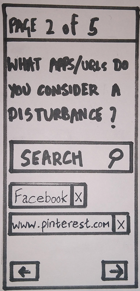
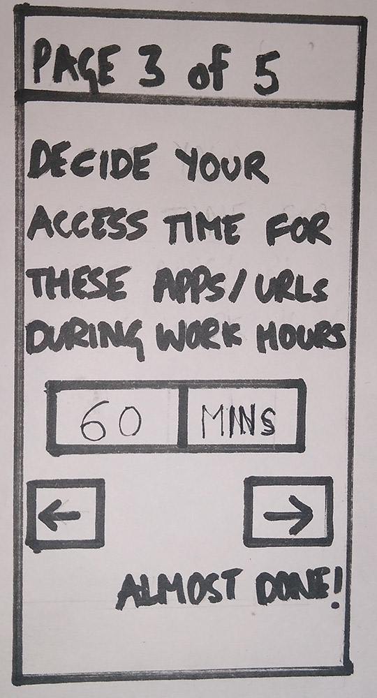
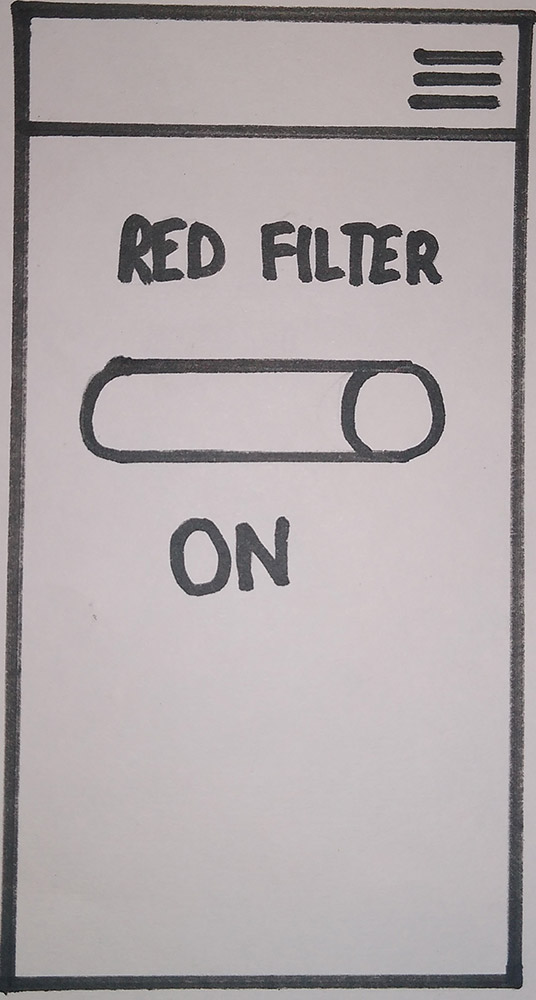
Paper Wireframes
Design
Heuristic Evaluation
After heuristic evaluation of the paper prototype, a list of violations were made and the changes implemented before translating the design onto Figma, following which an interactive version was made on InVision.
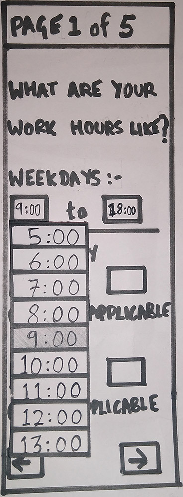
The changes made to the paper prototype addressed fundamental design flaws that were overlooked when creating the first paper prototype. Some of the screens are shown below...
Evaluate
User Test
The course requires students to test their prototype on two users. The test was done virtually on UserTesting.com with the participants sharing their screen and showing the InVision prototype as they use it. Participants were asked to think aloud as they completed the tasks and the sessions were recorded.
(Participant Consent Form and Usability Script are attached in the appendix).
Main tasks for participants : -
- Complete the onboarding process and answer all required questions truthfully to activate the filter and reach the home page.
- Find FAQ page.
- Edit details on profile page.
- Successfully deactivate filter.
Changes to be made based on user test feedback:
-
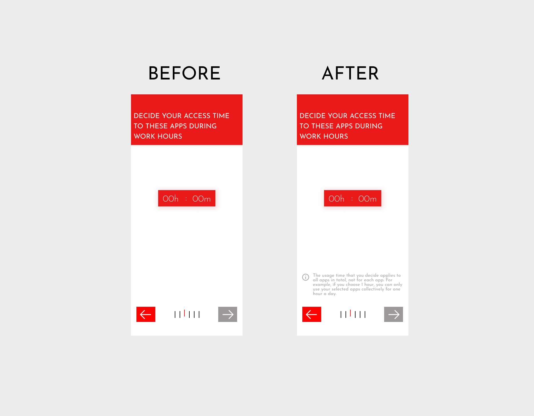
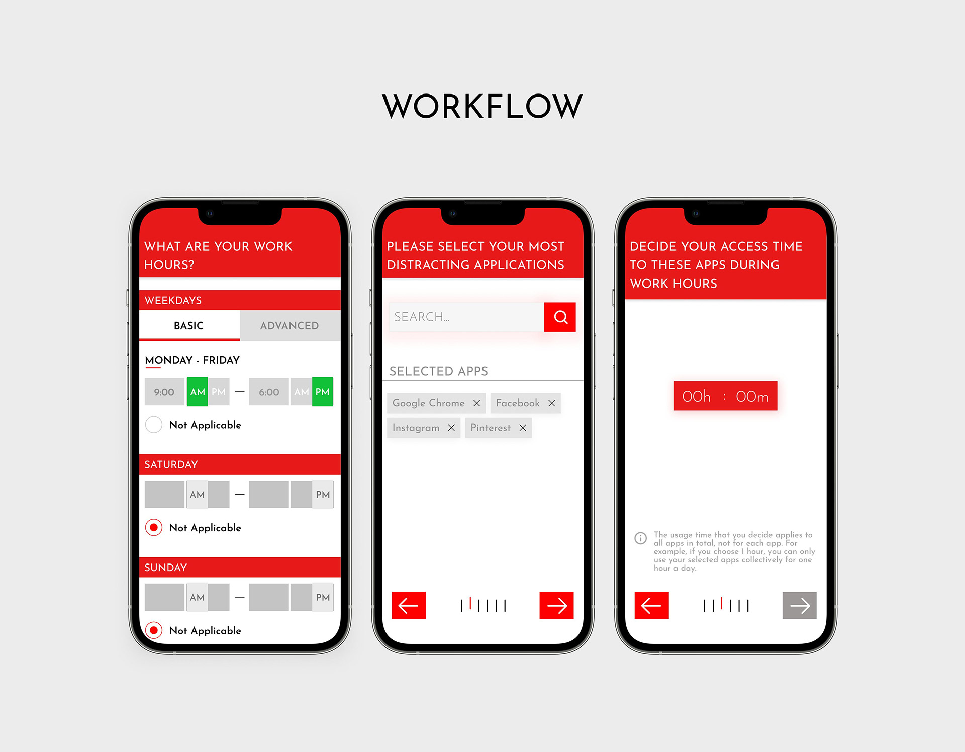
- Have tool tips on relevant pages to explain the onboarding question in detail. For example, on the usage time page have a popup that explains that the usage time selection is for all apps in total, not for each app.
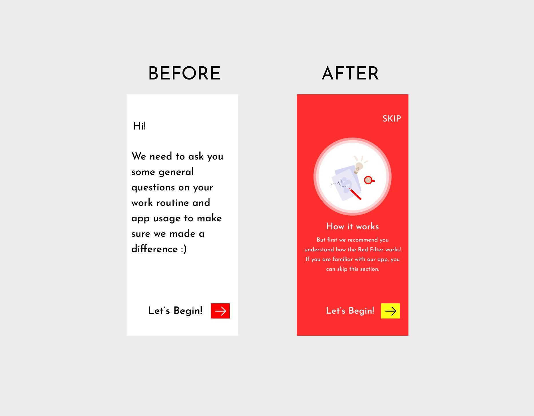
- Have the “how it works” in the beginning and make it optional (advanced users can skip this section).
- In the “how it works” section it will be made clear that the filter starts becoming red from the start of using the apps, not after the time limit.
- Time input field (for deciding user access time) should not go to a second page. Users can manually input the values from the main page itself.
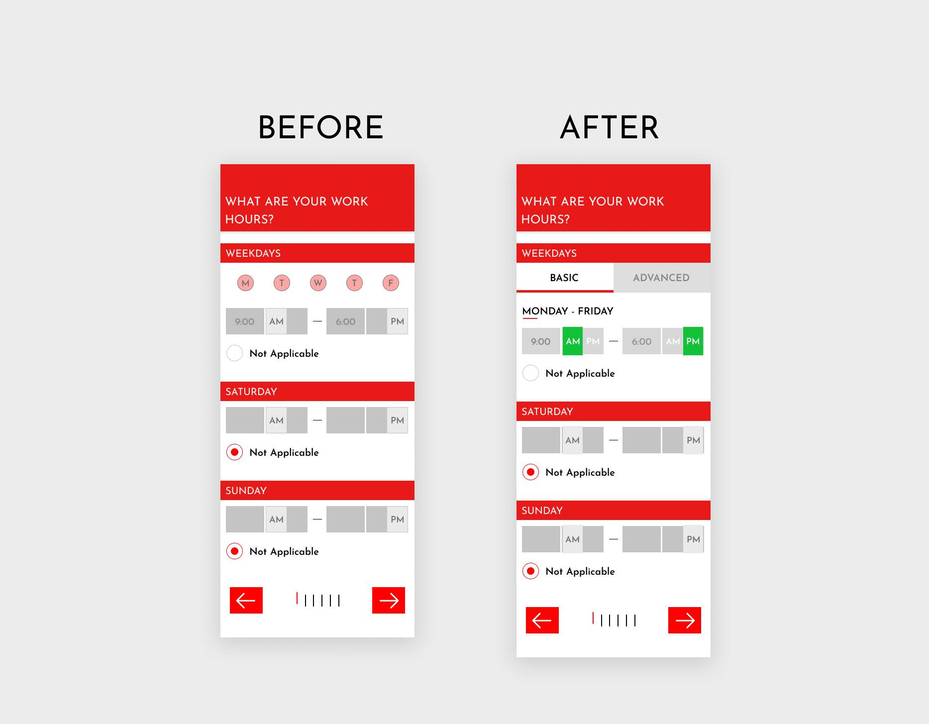
- Input field for time, AM/PM on question 1 should be less grey to signal that the input field is not locked and is editable.
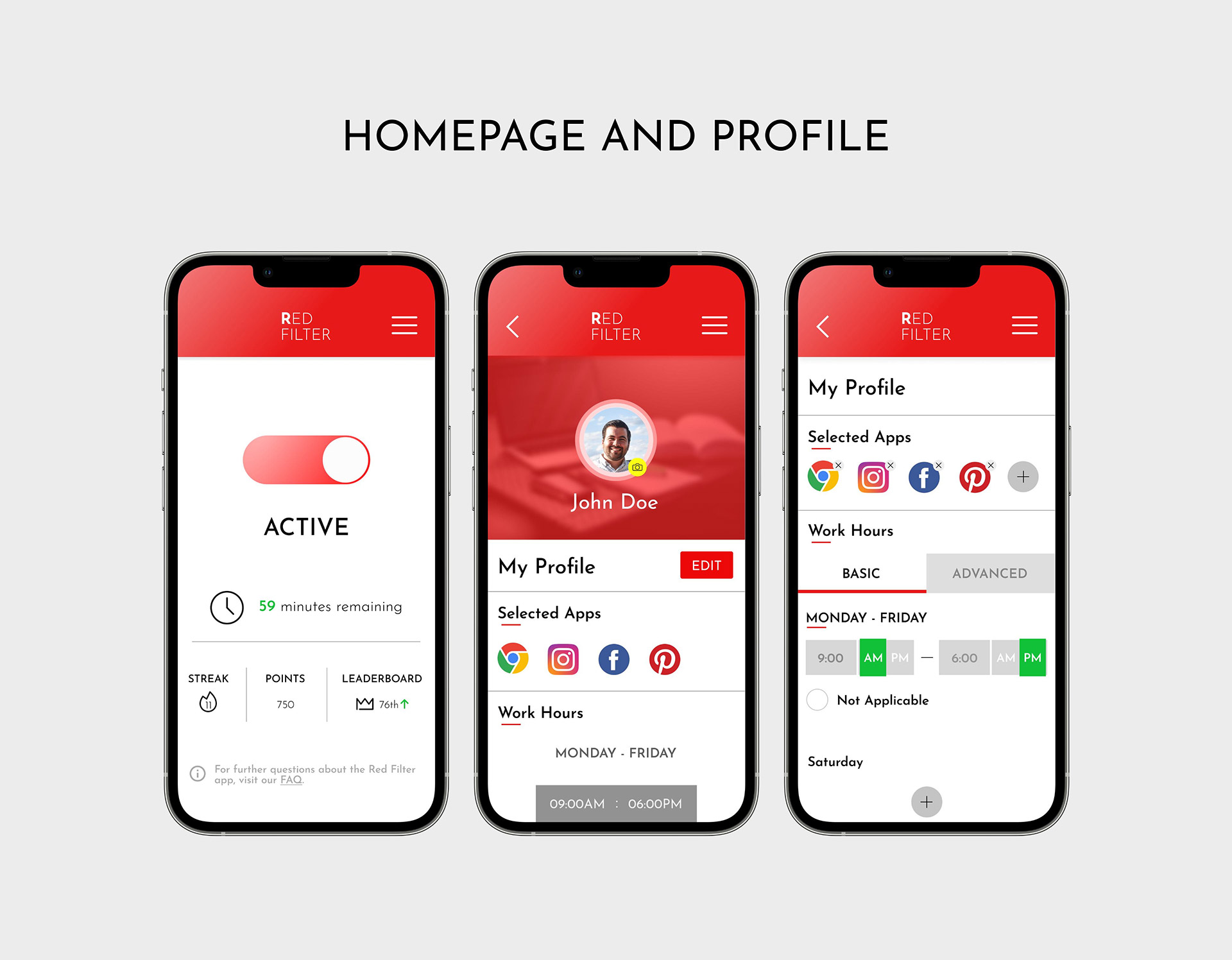
- Change edit button to larger icon with “EDIT” text label, or have edit text button for each sub section.
- Weekday buttons – give users two setting options – basic and advanced. Basic applies changes to all weekdays automatically. Advanced allows users to choose timings for each weekday.
Now we give users two setting options — basic and advanced. Basic applies changes to all weekdays automatically. Advanced allows users to choose timings for each weekday.
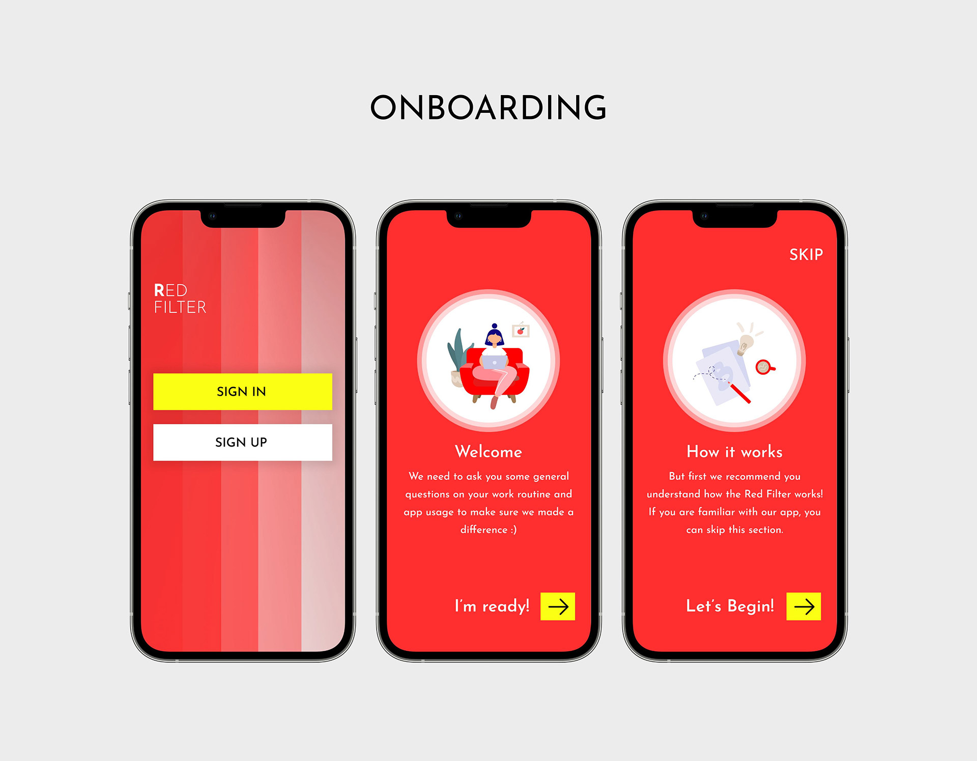
In this prototype, the “how it works” section is now in the beginning and has been made optional (advanced users can skip this section), unlike in the last iteration.
The time selection page has more help and documentation now to clear any confusion about what is required.


